
Salwar Suit Colour Combinations — by Skin Tone & Occasion
The right colour can make a simple suit look expensive, and the wrong one can dull even a designer piece. Choosing a flattering salwar suit colour combination comes down to two things: your skin tone and the occasion. This guide walks through both, with combinations that consistently work, so your next designer salwar kameez flatters you from the first wear.
Colours by Skin Tone
Fair Skin Tones
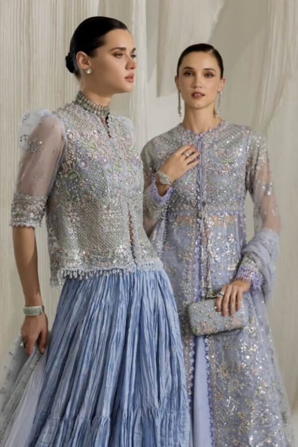
Fair skin carries almost anything, but jewel tones — emerald, sapphire, ruby and deep plum — look especially striking. Soft pastels like powder blue and blush work for daytime, while bold black and white provide crisp contrast. Avoid very pale beiges that can wash you out.
Medium & Wheatish Skin Tones
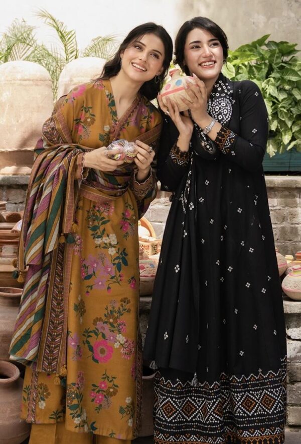
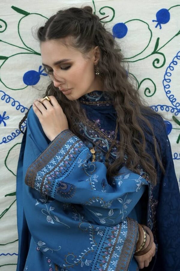
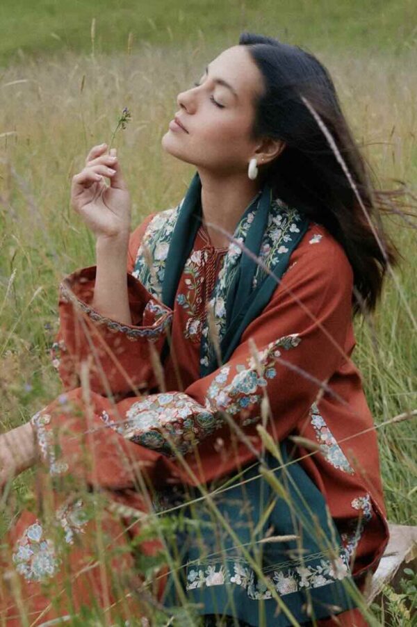
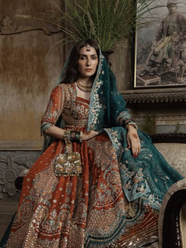
Warm, rich shades flatter wheatish skin beautifully — mustard, rust, coral, teal, olive and warm reds. Earthy and jewel tones both work, and gold embellishment is particularly complementary. This is the most versatile range of all.
Dusky & Deep Skin Tones
Deep skin tones glow in bright, saturated colours — fuchsia, cobalt, emerald, mustard, white and bold reds all pop wonderfully. Metallics and gold work beautifully too. Very muted greys and dull browns are best avoided, as they can flatten the look.
Colours by Occasion
Office & Daily Wear
Keep it understated and easy: pastels, soft neutrals, powder tones and tonal combinations. A pale lawn suit with subtle embroidery is the office-wear sweet spot — see our office ethnic guide.
Festive — Eid & Diwali
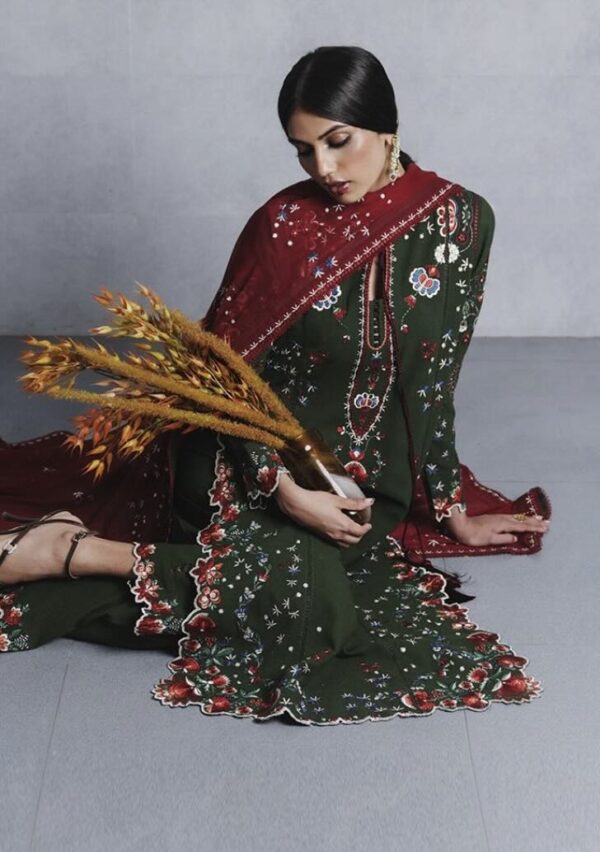
Festive dressing welcomes richer colour. Jewel tones and warm metallics shine for Eid, while reds, golds, oranges and deep greens suit Diwali.
Weddings
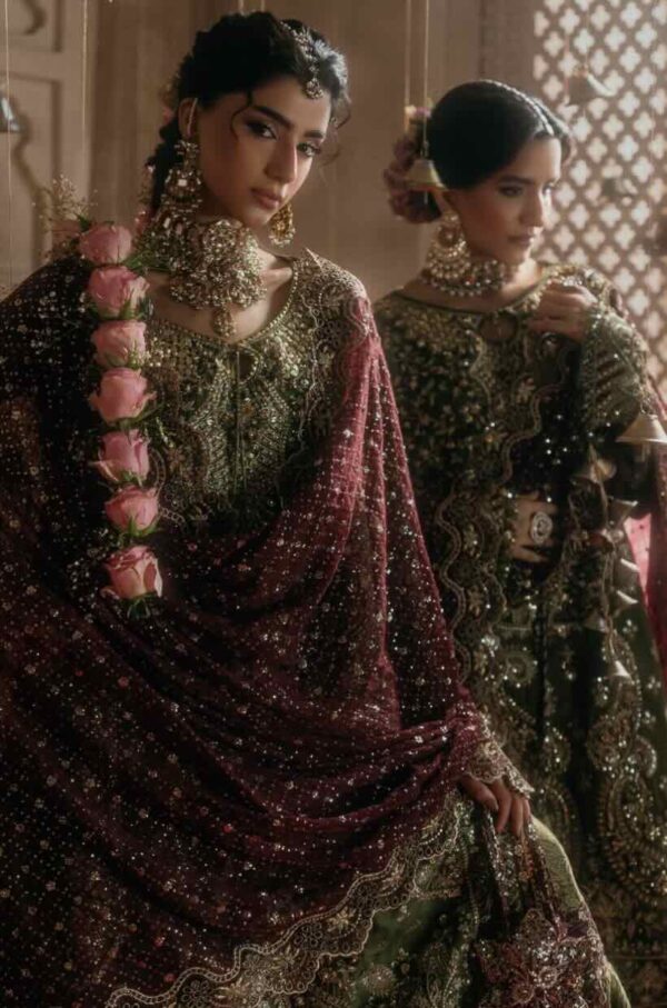
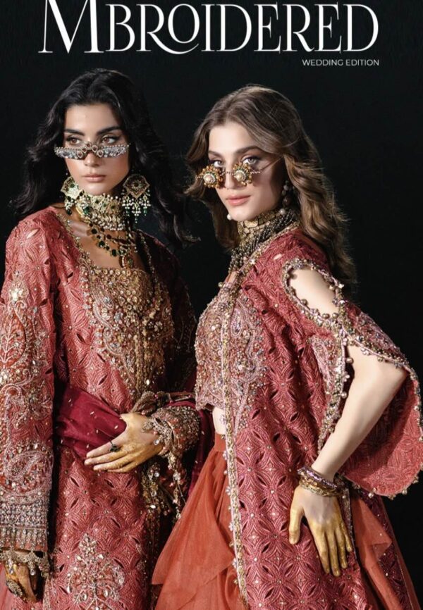
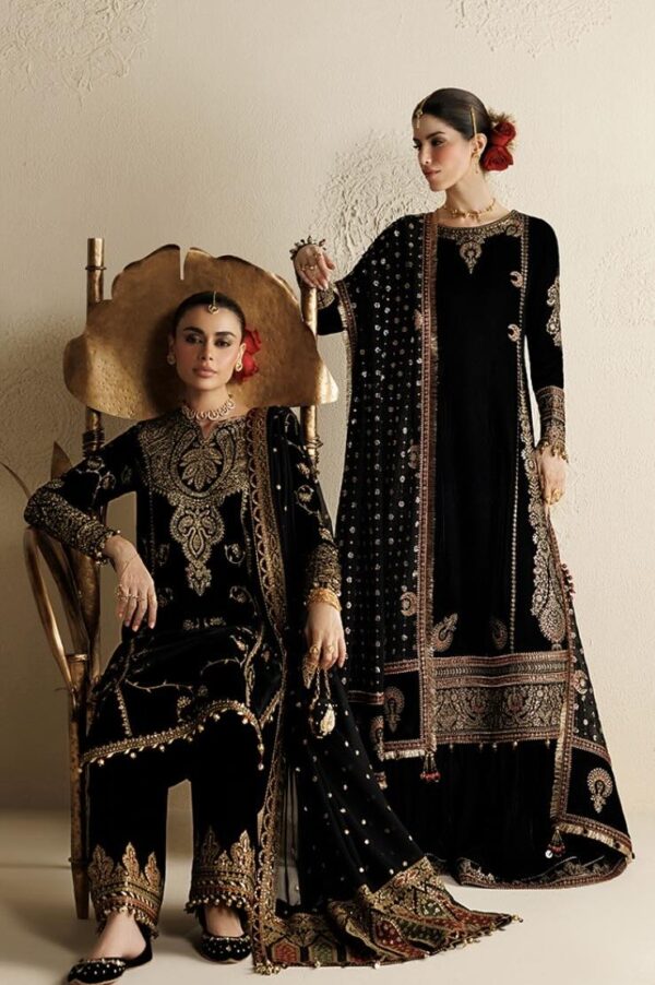
For weddings, lean into maroon, deep red, royal blue, emerald and gold — colours that read celebratory and photograph richly. Our wedding wear guide matches colour and fabric to each function.
Timeless Colour Combinations
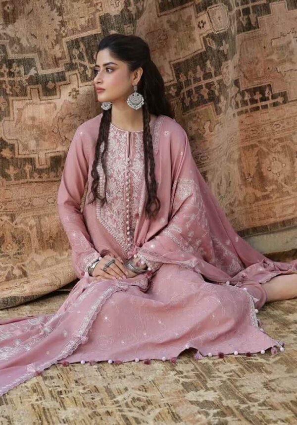
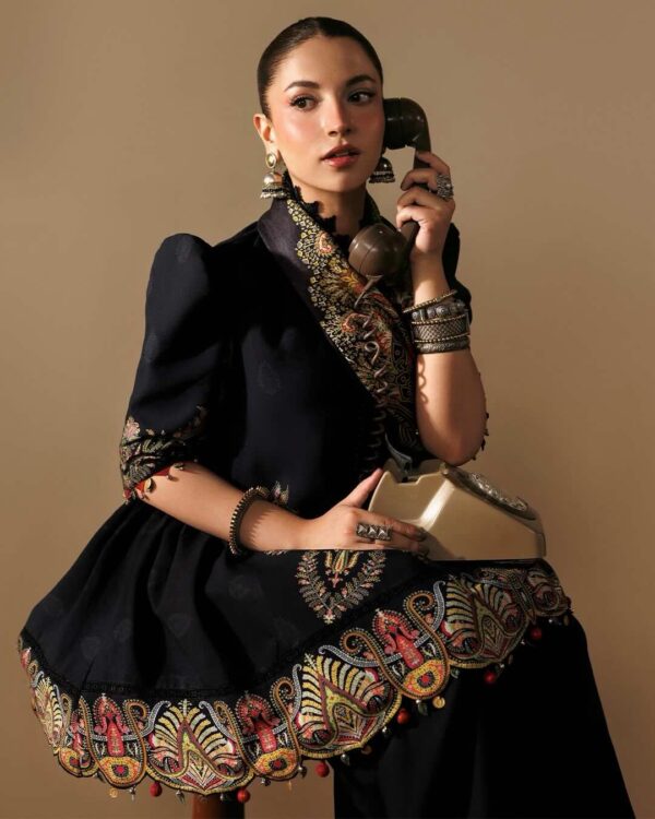
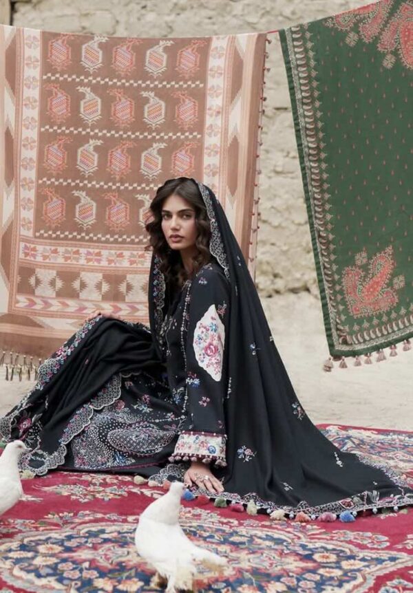
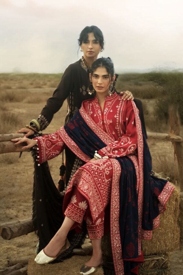
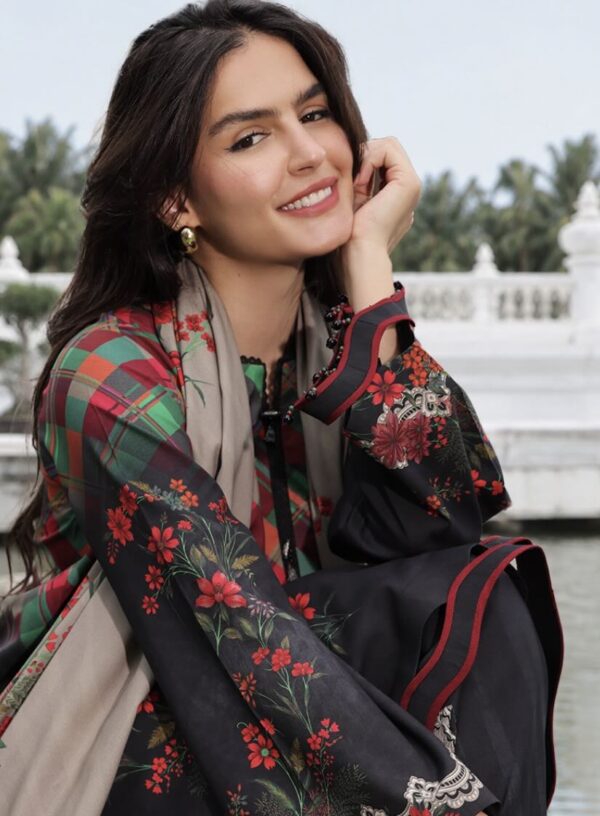
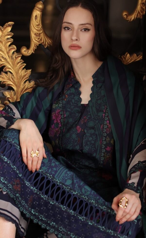
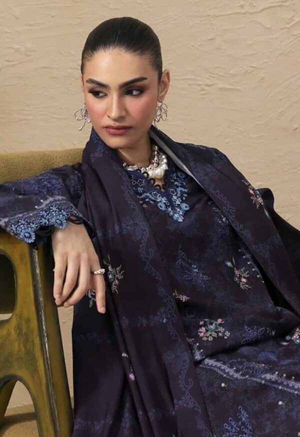
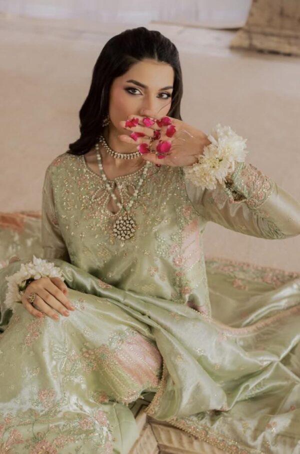
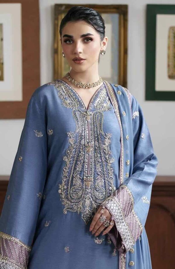
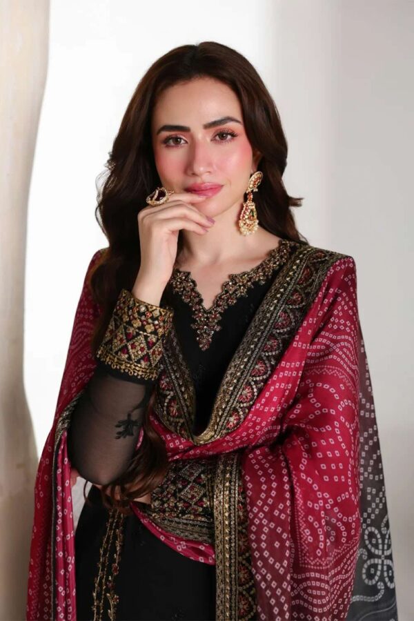
A few pairings never fail. Pastel-on-pastel (blush kameez, mint dupatta) feels fresh and modern. Contrast combinations — mustard with maroon, teal with coral, navy with gold — bring energy. Tonal or monochrome (shades of a single colour) looks elegant and elongating. And the classic black or white with gold is endlessly versatile. When in doubt, let the dupatta provide the contrast against a solid kameez.
2026 Colour Trends
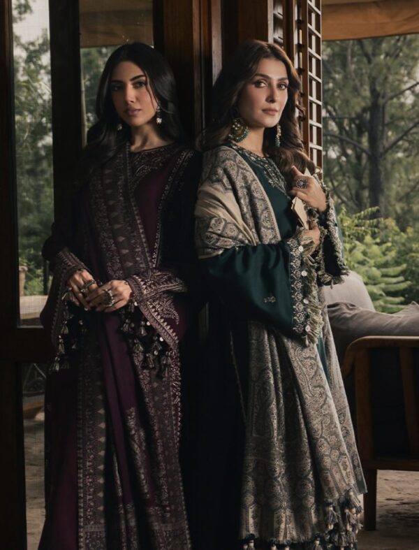
This season leans towards soft, sophisticated palettes — lavender, sage green, peach, butter yellow and dusty rose — often lifted with tonal or gold embroidery. Deeper berry and bottle-green tones carry into the festive and winter months. Pair the colour with the right fabric for the season — light lawn and chiffon for summer pastels, richer cloth for winter jewel tones — and the combination always lands. The principles behind these pairings come from basic colour theory: contrast for energy, harmony for elegance.
Colour Pairing Rules That Always Work
A couple of simple rules take the risk out of pairing. Follow a rough 60-30-10 balance — a dominant colour on the kameez, a secondary on the salwar, and a small accent (often the dupatta or embroidery) for contrast. Decide whether you want harmony (shades close together on the colour wheel, for an elegant, calm look) or contrast (colours opposite each other, for energy). Metallics — gold, silver, bronze — act as neutrals and lift almost any base. And when unsure, let a solid kameez do the talking and use the dupatta as your one bold note. None of this is complicated; it just keeps the eye comfortable.
Colours to Approach with Caution
A few combinations need a careful eye. Very pale beige and ivory can wash out fair complexions unless lifted with contrast embroidery. Flat, dull greys and muddy browns can dull deeper skin tones. Matching every piece to the exact same shade can look monotonous — a touch of contrast almost always reads richer. And neon brights, while fun, rarely suit formal or wedding settings where deeper, saturated tones photograph better. None of these are forbidden; they simply reward a second look in the mirror before you commit.
Match Colour to Fabric & Season
Colour and cloth work as a pair. Soft pastels feel right in light lawn and chiffon for summer, while deep jewel tones gain richness in heavier fabrics for the cooler months — explore those in our winter collection. A pastel in velvet can feel heavy, and a deep maroon in sheer summer lawn can feel out of season, so let the time of year guide both the shade and the fabric together.
Building a Versatile Colour Wardrobe
If you are starting fresh, build around a few reliable anchors: one classic neutral (black, white or ivory), one flattering jewel tone for occasions, and one easy pastel for daytime. From there, a couple of statement dupattas in contrasting shades let you restyle the same suits many ways. This approach gives you maximum outfit combinations from minimum pieces — and it means every new purchase slots neatly into what you already own rather than sitting unworn.
Shop Suits by Colour & Category
Frequently Asked Questions
Which salwar suit colour suits wheatish skin?
Warm, rich shades flatter wheatish and medium skin best — mustard, rust, coral, teal, olive and warm reds, often lifted with gold. It is the most versatile skin tone, so both earthy and jewel tones work well.
What colours are best for a wedding salwar suit?
Maroon, deep red, royal blue, emerald and gold are the most popular wedding colours, as they read celebratory and photograph richly. Pair them with embellished fabrics for the right level of formality.
What is a safe colour combination for a salwar suit?
A solid kameez with a contrasting dupatta is the safest, most flattering combination. Tonal or monochrome looks, and classic black or white with gold, are also reliably elegant choices.
Where can I buy designer salwar suits online in India?
The Fashion Station has sold authentic designer ethnic wear online since 2014, carrying 150+ brands with free shipping and Cash on Delivery across 26,000+ pin codes and 10-day returns. It is ISO 9001, 14001 and 45001 and SEDEX certified.